On the visualizations on this site
The goal of this project is to provide Lombardis drawings as datastructures. In a second step then, anyone can implement services on these datastructures. I do so on this site by making them searchable and explorable or use them for statistical and other calculations.
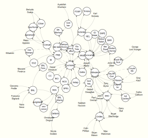
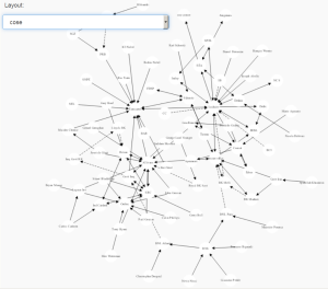
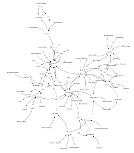
Visualization can also be a service, and there are currently two kinds of visualization. One is the interactive network on the services page which is programmed in Javascript using the d3js-library. The other visualization is the exported code generated by the Cytoscape tool. The desktop version of Cytoscape itself does a better job at visualization than the exported code, but one can expect that the export gets better over time.
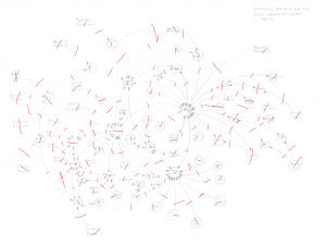
Here are screenshots of the three visualizations of the drawing Luchaire, Allivane and the Euro-Explosives Cartel c. 1980-9 and the original work:
| Original with marks from the digitization: | Javascript visualization: |
| Exported Cytoscape visualization: | Visualization within the Cytoscape 3.2.x desktop version: |
It shows that the algorithms used do not produce good visualizations. Perhaps the works on Lombardi graphs, that we reference in the library page, could perform better.
The question is, however, whether a non-interactive visualization of the networks is a useful service at all. We do have the perfect visualization with the original works already. An algorithm would simply try to reproduce them as close as possible and I assume that it would never reach 100%. If it would, it would be an identical reproduction of the work. Which makes no sense.
The the visualizations on this site are experiments with the data and do not try at all to imitate the works. While the interactive visualization is in fact a graphical information system since nodes can be clicked, the exported Cytoscape networks are just a cheap by-product from using that specific tool.


